Onboarding #8: Goodreads
Product? Goodreads
What does it do? Track books you are reading, see what friends read and discover new books based on what you’ve read
Home page

- Clear sign up form with just 3 fields: name, e-mail and password
Book recommendations from friends: social connect

- Little strange “getting started” title at the top
- Progress bar is good, so this is step one of four
- I like it that there is a clear explanation of what will happen with the contacts liked to the site
- They explicitly say that they store contact information as hashes: good stuff
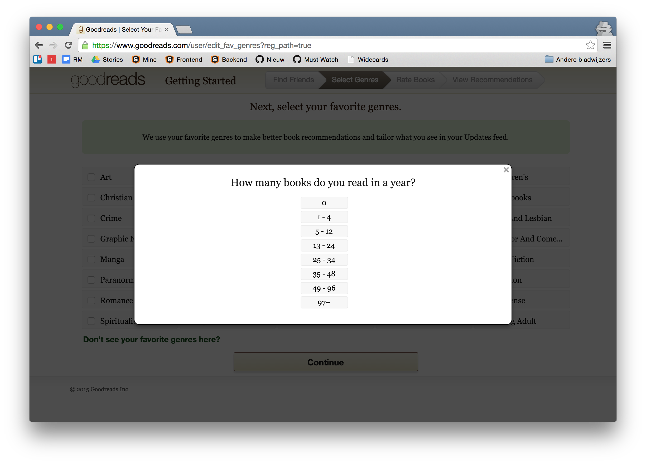
How many books do you read in a year / select genres

- First action is to select the number of books I read in a year. Not sure what is done with this information.

- After this, I can select the genres I like
- I do not have to select at least a couple of genres, it is optional
Rate books I’ve read

- Based on the books I’ve read Goodreads will give me personalized recommendations
- I like the progress bar, could use some animation though (no animation is used in Goodreads by the way, could really enhance the overall experience)
- Once I’ve selected books, more books like them pop up to either mark as read or mark as want to read for later
Recommendations

- Because I did not rate enough books, no recommendations are available. The previous screen showed recommendations, so why not show them here as well?
Push to connect Facebook

- Don’t see this often: Goodreads wants me to allows them to publish on my Facebook timeline
- These dialogs could use some design love, especially the placement of the close cross is really bad
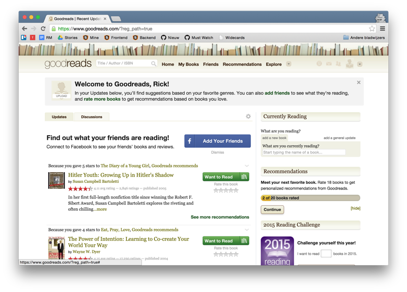
The Goodreads feed

- This view is really chaotic, all kinds of different buttons and actions to take
- Overall Goodreads is a great platform for discovering books and seeing what friends read, but it could really need a fresh, consistent design