Onboarding #29: Showdates.me
Pfew, last couple of weeks were chaotic to say the least. At Blendle, we announced that The New York Times, Washington Post and The Wall Street Journal will be added to our little kiosk soon.
So after all this, I found the time to write the two final pieces of my 30 day project which is no 30 day project anymore.
For the two posts I decided to take a critical look at things I created myself. The first one will be Showdates, a website I’ve built in 2012 to track your favorite TV shows (a bit strange since I’m not watching TV this year). In the final post I will tear apart the Blendle onboarding. That is going to be great.
Home page

- The Showdates home page should be inviting: it contains popular shows everyone knows
- The four screensnaps display key features. The hover effect does not really contribute to what I want to achieve, because there is no visual indication that there is stuff to read on hover.
- There is no indication that the site is free to use
- The link to a “normal” signup was added later and it tiny compared to the signup with Facebook and Twitter buttons
Sign up

- The form is pretty long in retrospect
- It is not clear why I should pick a username and provide my emailaddress
- Password confirm could be left out
- I’m getting a warning for my username length on entering the username field, I’d consider that a bug
- On entering a valid username, it will give me a green checkmark
Pick TV shows

- I have to pick at least 4 shows before I can continue
- There is no indication of how many followers a show has
- Autch, the green I used is REALLY busting my eyes right now. I’m definitely no designer :)
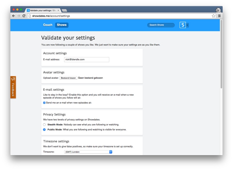
Validate settings

- Don’t really know why I added this step anymore. Would leave it out if I’d rewrite it
- Especially “Provider settings” are awkward if you haven’t use the product yet
- E-mail address, e-mail settings are duplicate from my signup
Couch

- After confirming my settings, I’m being transported to my couch
- I see the first episode of every show I selected during signup
- One thing I’d improve is that there should be an option to mark the show as completely watched right from the signup (this option is available on the show detail page, but it is a bit hidden)
- You’ll receive a friendly welcome message after signing up