Onboarding #14: Staply
Product? Staply
What does it do? Create online notebooks and discuss its content with others. All in a nice and clean interface.
Home page

- Friendly page, friendly colors
- This landing is the absolute opposite from the Foursquare home page
- Clear CTA: either log in or sign up
Sign up

- Short form with no unnecessary fields
- An option to return to the log in page, if I ended up clickin on the wrong button
Check your inbox

- This is actually the first application where I need to confirm my e-mail before I’m able to continue to the app
- A link to my inbox (using my gmail account) is given, nice touch
- Might be a spelling error in it, but I’m not 100% sure
Activation e-mail

- In this case I’ve included the e-mail because it is part of the onboarding process
- E-mail itself is clean, with no additional stuff that doesn’t belong in the activation e-mail
- Confirmation link does not link to https, but links to the http version
Welcome tour

- After clicking the link, I’m presented with a tour. First step is just a welcome with a “skip tour” link
- The bullets at the bottom of the screen indicate 4 additional screens
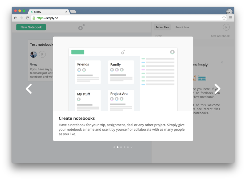
Create notebooks

- No action required, just some information
- I like it that I can jump forward and backward in the tour if I want to
Add files and links to the notebooks

- Again, no action required
- Information on how linking files works
Finding stuff within notebooks

- Still no action required
- Information on how search works (but it is not clear from the image how search actually works)
Develop your ideas

- Ok, this is just a tour with images. I get it now. :)
- Apparently it is about discussing a specific file that was added to the notebook
Final tour screen

- No comments, except for the fact that however there were some nice screenshots in the tour, I’d prefer an interactive guide. All of this could be told while setting up a sample notebook.
Staply dashboard

- And after the tour, I’m ready to start creating notebooks and share them with others.